

6 Effective Tips For How To Make A Business Letterhead
How to make a letterhead that looks professional, authentic, and legit. These six effective tips have you covered. In this article, we’ll outline what you can and should do to create a business letterhead.
1. Color choice
In terms of color choice, you have a lot to choose from. Thus, if you’re not obliged to use your company’s existing color palette or business letterhead templates, you might as well try to explore. Here are a few tips or guidelines to get you started.
A.) Use contrasting colors
Pick a maximum of four colors. As you choose, keep contrast in mind. Check out this color wheel.

For you to be guided with regards to contrast, look at this color wheel when deciding what color to use. To find out what color contrasts with one another, simply look at the opposite end of your color choice. For example, if you want to use blue, then its strongest contrasting color is yellow; if you choose green, then it’s pink.
B.) Use colors that blend
In direct contrast (wink, wink) to the previous tip, use colors that blend. Think of color gradients. If you don’t know what color gradients are; color gradients showcase one color transitioning to another in the smoothest form. Here’s an example of a gradient; if you’re going to use a maximum of three colors, use light yellow to orange to red.
You’ll see in the color wheel that they are beside each other; thus, closely relating to one another. Using this color scheme creates a harmonic view for the eyes and it is very pleasant on paper. It helps create a very stylish yet professional business letterhead.
2. Format
Do you want to use a header, a footer, or both for your business letterhead template? Think carefully as this will serve as the corporate signature the company will be remembered for.
Use a striking, colorful, and creative footer or header for your business letterhead template. If you choose to use both, make sure that:
- Details aren’t redundant
- Colors complement or mix with each other
- No unnecessary details are placed
- Make sure that sightliness isn’t sacrificed
It is one thing to be thorough and complete with company details; however, we believe that sacrificing orderliness and design coherence for the sake of fitting both a header and a footer is ill-advised. If you must, heed the advice in this chapter and you should be fine.
3. Design
Here are a few things you might want to consider adding (or subtracting) when deciding on a design:
- Custom border
– With or without?
– Colorful or one-tone?
– Stylistic or minimalistic?
- With or without logo
- The header
– Slanted or asymmetrical?
- The footer
– Stylistic or simple?
- Add illustrations or not?
- Fit in a spine column or not?
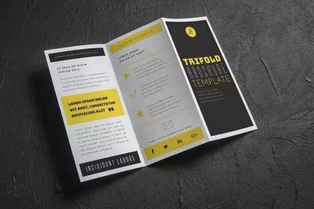
4. Logo
![]()
Most companies would choose to place their logo in their business letterhead; however, this isn’t mandatory. You may or may not place your logo. However, it is generally better practice to include your logo unless you’re going for a very specific aesthetic or business decision that doesn’t allow you to do so.
You may place the logo at the top left, top right, top center, or as an opaque background to your overall paper. You may include the logo in your header or footer, just make sure you don’t sacrifice tip number two in this article.
5. Background color
Most of the time, everyone’s default is a plain white background. However, that too isn’t mandatory. You may choose to use your company logo as the background of your letterhead, as previously stated. You may even use black for a more striking appearance. Make sure you adhere to a few basic rules or guidelines to make sure your background doesn’t interfere with the overall aesthetic of the letterhead or the message of the letter itself.
- Use dark text on light backgrounds and light text on dark backgrounds. Otherwise, it might not be visible enough to be legible!
- Avoid using too many different colors
- When using a color gradient for the background, stick to a maximum of three colors unless you’re going for a specific design choice.
Quick tip:
Using gold text on a dark blue background is very striking and appealing. Try to use it if it fits the narrative of your company or business letterhead.
6. Styling vs Minimalism
Being stylistic in designing your business letterhead is fine; however, overdoing it might be at the cost of your company image. Having a minimalistic approach is fine as well; however, being too minimalistic might make the paper look rushed or low-effort/low-quality. Thus, striking a balance here is crucial.
Styling
You may use the following techniques:
- Using a colored background instead of defaulting to white
- Add a border or add a custom, asymmetrical border.
- Customize the header, footer, or spinal page
- Add a geometrical pattern with eye-catching colors
- Use a beautiful color gradient that accentuates the message of your letterhead
- Use an illustration or photo to frame your letter
FAQs
- Why invest in a great business letterhead?
A business letterhead is a visual representation of the company and an extension of its values. It’s a very important document that has the power to give a positive first impression. Creating wonderful impressions creates more business; thus, it is important to have one that looks professional and is well written. Think of it as another tool to help the business grow.
- Is it hard to make?
There are many templates online; however, it shouldn’t be too hard to make one for yourself if you have some basic designing background or capabilities.
- Are these expensive?
Certainly not! The hardest or most costly part should only be designing.


Leave a Reply