
Flyer Design 101: How to Create Eye-Catching Promotional Materials
In a world brimming with visual stimuli, the ability to capture attention is more crucial than ever. Enter the humble flyer—a powerful tool in the arsenal of promotional materials that, when designed thoughtfully, can transform an ordinary message into an extraordinary visual experience. whether you’re a small business owner, an aspiring event planner, or someone looking to share a community message, mastering the art of flyer design can unlock new avenues for engagement and outreach. In this article, we will explore the basic principles of flyer design, offering a extensive guide on how to create eye-catching promotional materials that not only convey your message but also inspire action. Join us as we delve into the essential elements that can elevate your flyers from simple pieces of paper to impactful communications that stand out in a crowded landscape.

Understanding Your Audience and Their Preferences
To create a flyer that resonates, it’s crucial to envision the audience who will ultimately engage with your materials. Understanding their demographics, interests, and behaviors can inform every aspect of your design, from colour schemes to imagery. Consider elements such as:
- Age Group: tailor your message and visuals to the specific age range, whether it’s vibrant and youthful or sleek and complex.
- Location: Localize your content to reflect cultural nuances or regional preferences.
- Interests: Align your flyer’s themes with activities and topics your audience is passionate about.
Gathering and analyzing feedback can also guide your design process. Use surveys or social media insights to discover what captures the attention of your target audience most effectively. By segmenting your audience, you can craft tailored promotional materials that are not only visually appealing but also drive engagement. For your reference, here’s a simple table to illustrate key audience segments:
| Segment | Key Preferences |
|---|---|
| Young Adults | Bold colors, trend-driven content |
| Families | informative, family-oriented visuals |
| Seniors | Readable font, classic design |
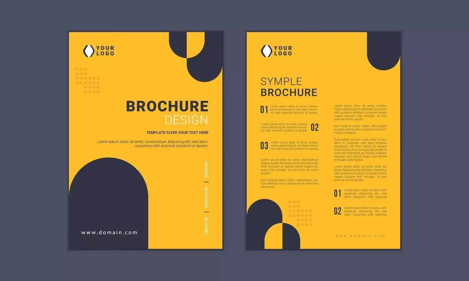
Essential Elements of Effective Flyer Layout
When designing an effective flyer, it’s crucial to strike the right balance between aesthetics and functionality. Start by establishing a visual hierarchy that guides the reader’s eye to the most important elements first. Use larger fonts for headlines and bold colors to draw attention. In addition, maintaining sufficient white space is vital; it prevents the design from feeling cluttered and helps critically important details stand out. Consider organizing your content in a way that makes it easy for the viewer to digest, using bullet points to highlight key offers or features:
- Catchy headline that captures attention
- Subheadings for additional context
- Clear calls to action (e.g.,”Visit us today!”)
- Contact information prominently displayed
Moreover, imagery plays a significant role in the overall impact of a flyer. Using high-resolution images can evoke emotions and encourage engagement. A well-thought-out color scheme that aligns with your brand identity enhances recognizability and adds professionalism to your layout. Below is a simple table showcasing effective color combinations that resonate well in flyer designs:
| color Combination | Emotional Response |
|---|---|
| Blue & White | Trust & Calm |
| Red & Yellow | Excitement & Energy |
| Green & Brown | Nature & Stability |
| Purple & Gold | Luxury & Creativity |
Choosing the Right Typography and Color Palette
When it comes to capturing attention and conveying your message effectively, typography is a critical component of your flyer design. Your font choices should align with the vibe of your event or promotion. Opt for bold, easy-to-read fonts for headlines and complementary styles for body text that facilitate readability. Consider using a mix of serif and sans-serif fonts to create a dynamic look, ensuring that important details stand out. Additionally, be mindful of line spacing and letter spacing to enhance legibility, especially for smaller text. Here are some essential tips when selecting fonts:
- choose a maximum of two to three fonts to maintain consistency.
- Opt for 10-14 pt size for body text to ensure clarity.
- Use bold styles for emphasis on key information.
Equally important is your color palette, which can evoke emotions and set the tone for your promotional materials. Colors have the power to draw attention or create a sense of calm, so think about the message you want to communicate. Use a primary color that reflects your brand identity, and pair it with two or three accent colors for contrast. Consider the psychological effects of colors; as an example, blue often represents trust, while red can evoke excitement. check out the following table that outlines examples of emotional responses to different colors:
| Color | Emotional Response |
|---|---|
| Red | Excitement, passion |
| Green | Growth, tranquility |
| Blue | Trust, calmness |
| Yellow | Happiness, energy |
Incorporating compelling Imagery and Calls to Action
To truly make your flyer stand out, integrating compelling imagery is essential. High-quality visuals capture attention and convey the message of your promotion almost instantaneously. Choose images that relate directly to your campaign’s theme and evoke the desired emotions in your audience. Consider the following elements when selecting imagery:
- Relevance: Ensure the image aligns with your product or service.
- Quality: Opt for high-resolution images to maintain professionalism.
- Color: use colors that complement your brand and enhance visual interest.
Equally important are the calls to action that guide your audience towards the next steps. A well-crafted call to action can dramatically increase engagement and conversions. Make your CTAs clear, concise, and compelling. Use action-oriented language and suggest urgency where appropriate. here’s a simple table highlighting effective phrases:
| Action Phrase | Purpose |
|---|---|
| join Us Today! | Encourages immediate action. |
| Limited Time Offer! | Creates a sense of urgency. |
| Get Your Free Sample! | Appeals to potential customers with an incentive. |
In Conclusion
As we wrap up our journey through the vibrant world of flyer design, it’s clear that creating eye-catching promotional materials is both an art and a science. Armed with the principles and techniques discussed, you now possess the tools necessary to transform a simple idea into a striking visual statement that resonates with your audience. remember, a successful flyer is not just about stunning graphics or catchy text; it’s about understanding your goals and conveying your message in a way that captures attention and inspires action.
So whether you’re promoting an event, showcasing a product, or building brand awareness, take these insights to heart and let your creativity flourish. Experiment, iterate, and don’t shy away from thinking outside the box—your next flyer could be the catalyst for your success.So go ahead, let your designs fly, and watch as they take your promotional efforts to new heights!
Leave a Reply